Charts provides a way to visually display data in the form of charts or graphs within a software application or user interface. Charts makes it easy to analyze and interpret data that is often presented as a text report.
You can use the Grid controls filtering capabilities to customize the contents of the Chart.
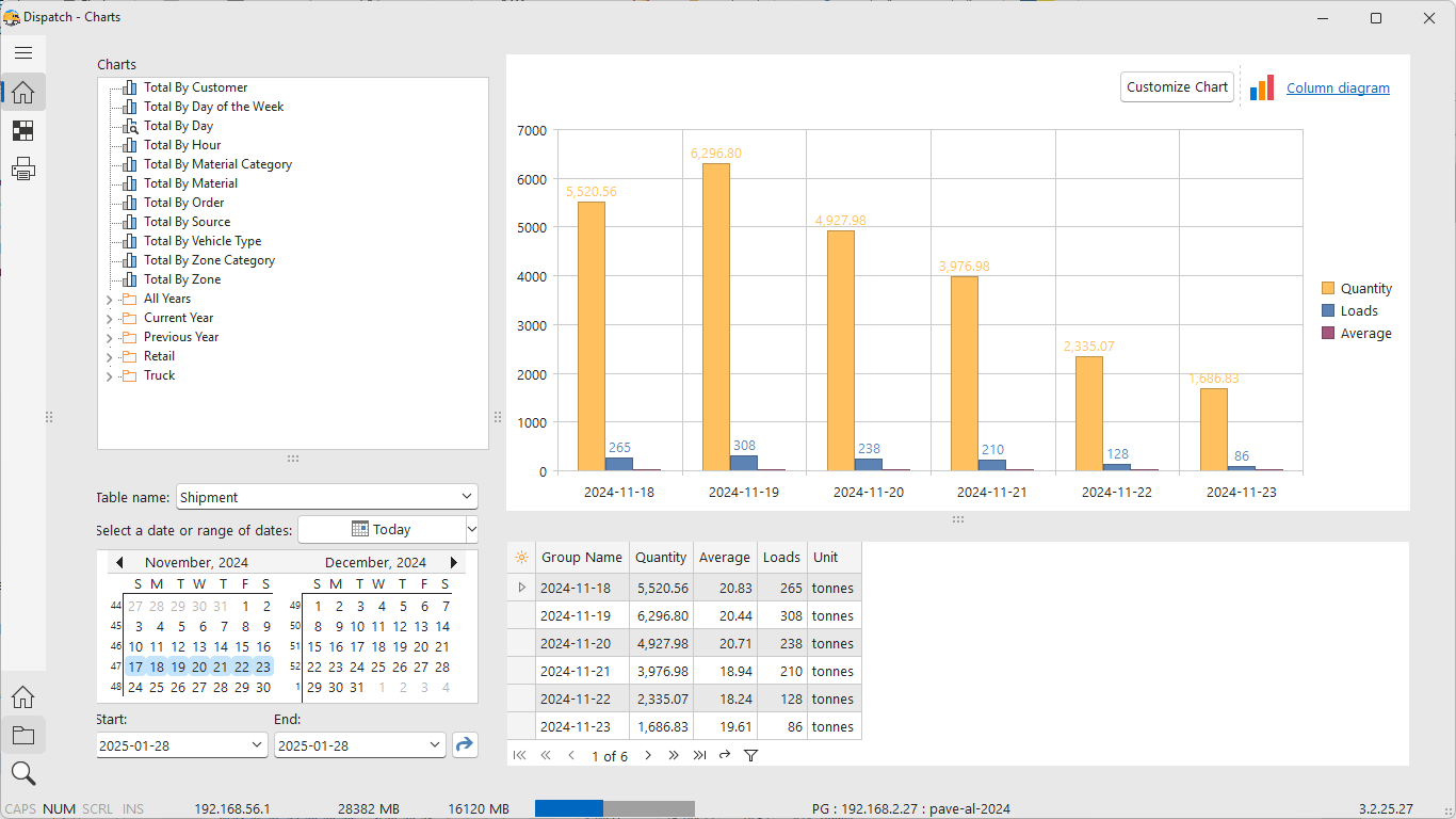
The chart in the example below shows the tonnage and load count totals by day for the period of November 17-23.
Key purposes of Charts
Data visualization
Charts allow users to see patterns, trends, and relationships in the data that might not be immediately apparent from raw numbers or tables.
Simplification of complex data
A chart control condenses complex data into a format that is easier to comprehend and interact with.
Customization and interaction
Chart controls often come with options to customize the appearance (e.g., colors, labels, axes) and provide interactive features like zooming, tooltips, and data filtering.
Dynamic data display
In many cases, chart controls support real-time data updates, which is essential for dashboards, live monitoring systems, or analytics tools.
Support for various Chart types
A chart control usually supports a range of chart types, such as bar charts, line charts, pie charts, scatter plots, and more, allowing users to choose the most appropriate visualization for their data.